Table of contents
Introduction
Building little projects to scratch one’s own needs is a great way to practice the craft of software development, or at least this is some consistent advice I have picked up from legendary figures in the field. Whether it be formulated by the famous John Carmack (an excellent interview with Lex Fridman was recently released) or a rising star like The Primeagen (he has a fantastic YouTube channel too), the core of the message remains the same: deliberate practice is required to make progress.
While I was in the middle of completing a BSc in computer science, I decided that a simple and reliable spreadsheet was not enough to keep track of my grades and decided to tackle the creation of a TUI — terminal user interface — to come to my rescue by providing, hopefully, correct answers. And so uol-grades-calculator (ugc for short) was born out of the desire to learn more about TDD in a practical way, the Hypothesis testing library written in Python, Sphinx and Read The Docs for publishing nice-looking documentation in reStructuredText format (the Markdown format being another option). Even though the goal of this tool has never been to gather a growing user base, it was a good learning experience because alternatives to it spawn up over time and, arguably, some of them were much friendlier and simpler to use (who would have thought that…).
Setting up the stage
To put things in perspective, this tool was never really under active development, but it did receive updates from August 2020 until September 2022, so the project slowly took shape in a time frame of a little over 2 years as can be shown in the following repurposed Gantt chart, where the length associated with each Git commit corresponds to the amount of time elapsed from one commit to the next.

Vim magic behind the scenes
While the chart itself is neither the prettiest nor the most interesting, the how of it has a possibly more entertaining story attached to it:
- The list of commits was extracted with the command
git log --pretty=format:'%s : %cs' > commits.txtto get a one-liner for each commit with the description followed by the date, piped/stored in the text filecommits.txt. - Some Vim regex magic was done to substitute the first ‘
:‘ character on each line so that Mermaid wouldn’t struggle to render the graph: ‘%s/^\(\w\+\): /\1 - /‘. This pattern was actually predictable because the Conventional Commits specification was followed religiously right from the beginning. - The previous command left some ‘
:‘ characters in there that weren’t needed, so they were removed except where a digit was immediately following such that the last part of the line including the date would be left in place (here,\vis the “very magic” flag used so that we don’t need backslashes around the captured group, i.e. the digit, which looks a bit more readable): ‘%s/\v: (\d)@!/ -‘. - To show the elapsed time between two commits, a Vim macro was concocted so that the date on the current line would be copied and pasted on the following line in a specific way, which works because the Git history appears in chronological order by default: ‘
kf:wv9ly0jA,^[pj0‘. It’s Ugly but it gets the job done ;). - In essence, it goes up by one line (
k), searches for the:character withf(which precedes the date), moves ahead by oneword, highlights the date which is in the formatYYYY-MM-DDwithv9l, yanks/copies the date withy, goes back to the beginning of the line (0), goes down one line withj,Appends a,at the end of the line, goes out of insert mode with aCtrl - cshortcut (which visually translates to the escape sequence^[),pastes the date, goes down one line again withjto be ready to process the next date and goes to the beginning of the line again with0so we don’t miss a match. Vim macros are definitely quite expressive in a terse way! - Then, it’s just a matter of running the macro for the number of lines below the cursor in the file. We can quickly get a sense of the number of lines in the file with
Ctrl - gand run the macro on the required number of lines with100@a, replacing100with the number of lines andawith the register where the macro was saved (in this case, in the registerawithqato start recording the macro there, which is to be stopped by pressingqonce more in normal mode). - Once the macro is run, the output needs to be reversed so that the initial commit can be displayed where the graph starts in the top-left corner, which can be done with the clever command ‘
g/^/m0‘: it runs on every line of the file, successively putting each line at the very top of the file (line0) to have the effect of reversing the whole document! - Finally, the graph is generated literally by copying and pasting that list of commits into a Mermaid textual chart, which shall be the topic of another post!
The whole process is done in a few minutes at most, making it a nice solution to deal with manageable outputs under a few thousand lines. Otherwise, it might be more convenient — albeit a bit more time consuming too — to write a script to do the work since Vim macros, when run at a relatively large scale, can be slow and error-prone.
What went well
With all that fluffy preamble, we might hope that something went well in the end. Well, there were a couple of noteworthy things indeed:
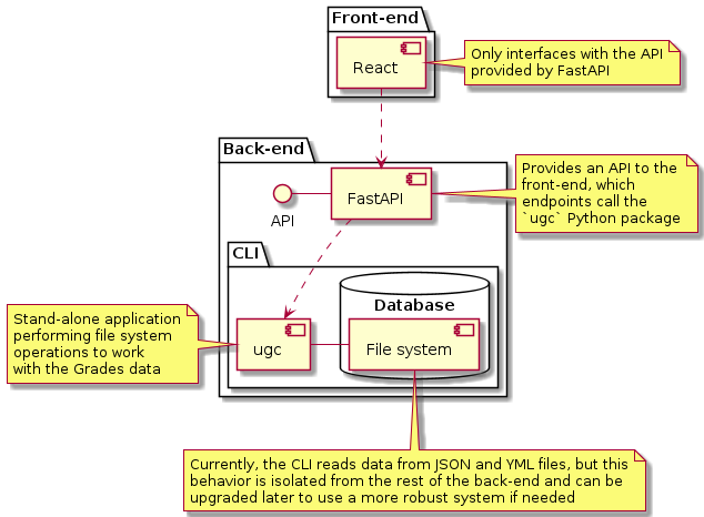
- Even though I worked on this project alone, I created a bunch of GitHub issues that I assigned to myself, each with its own set of tasks, acceptance criteria, a short analysis section as required, linked pull requests and referenced commits. It is more work and arguably could be done more simply in a notes application, but it feels good to be publicly accountable for one’s work and that also encouraged (very few) people to submit their own issues. Additionally, managing tasks on a platform like GitHub makes it easy to review the state of a project and to manage a backlog of tasks, which was a nice plus when the project was linked to what was meant to be its successor, uol-grades-calculator-server, a backend using
ugcas its API which was to be hooked to a React frontend to display the data (more on that in the list of things that went poorly). - The TDD approach was embraced right from the start and I consider that being one of the highlights of the project in hindsight. With over 250 tests (some of which are randomly generated to do property-based testing with Hypothesis), I felt confident it was giving somewhat sensible answers.
- Best practices were adopted: Pylint, the king of complainers amongst the Python linters, was very verbose but set up to be slightly more quiet after a while. A
pyproject.tomlfile was included, a cleanpytestconfig file was used to automate the input of some parameters when running the test suite, the project was developed with the intention of being deployed as a package, only popular and stable libraries were used and just as importantly, only portable formats like JSON made it to the final version of the project. - Sub-modules were created to make everything a bit more… modular.
- A GitHub workflow was added to automatically deploy new releases to PyPI.
- Documentation was generated and hosted on Read The Docs, with clean outputs and images and an entire section dedicated to developers (i.e., myself :)) so that reproducibility wouldn’t become an issue for any step taken along the way.
- Using pre-commit helped with catching some annoyingly formatted code before reaching production by taking advantage of Git pre-commit hooks.
With what seems like a glowing review so far, needless to say, a whole lot went wrong too.
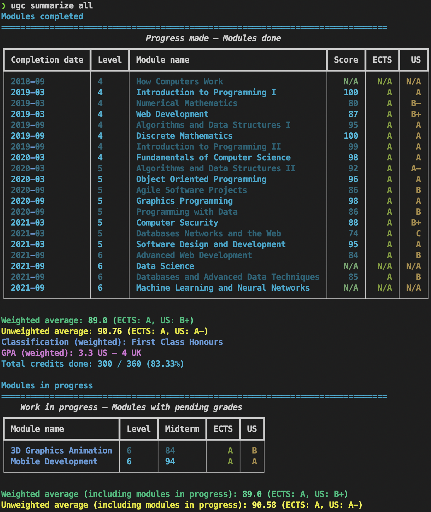
summarize command.What could have been done better
- Independently of the expectations with regards to the user base, it would have been beneficial to do more research and planning initially before writing a single line of code. After working on other projects, I’ve found that what works well for me is to follow a specific set of steps, broadly speaking:
- Gather a list of requirements as precisely as possible to validate assumptions and define the correct scope for the work to be done (YAGNI!);
- Produce some early flowcharts to make sense of how the application might be structured and iterate on this until a clear winner emerges;
- Produce low-fidelity wireframes (even for a TUI, that would be informative before committing to doing the wrong thing!) — even if this is just quickly sketched on paper;
- Create high-fidely mockups (or at least reasonable-looking ones for a small project like this one) once things have been thought through carefully;
- Design a general plan of work before writing any code to have a better idea of how the different parts of the system should communicate together;
- Research existing tools to be leveraged so as to not re-invent the wheel all the time and see how they fit in together;
- Go with TDD and stick to it piously for anything of relative importance that should be tested;
- Go at it with atomic commits so that rewinding errors on the path will be a breeze — at least that ought to help significantly.
- Related to the first point, issues could have been more substantial instead of having to often deal with useless refactoring due to not thinking things through fully.
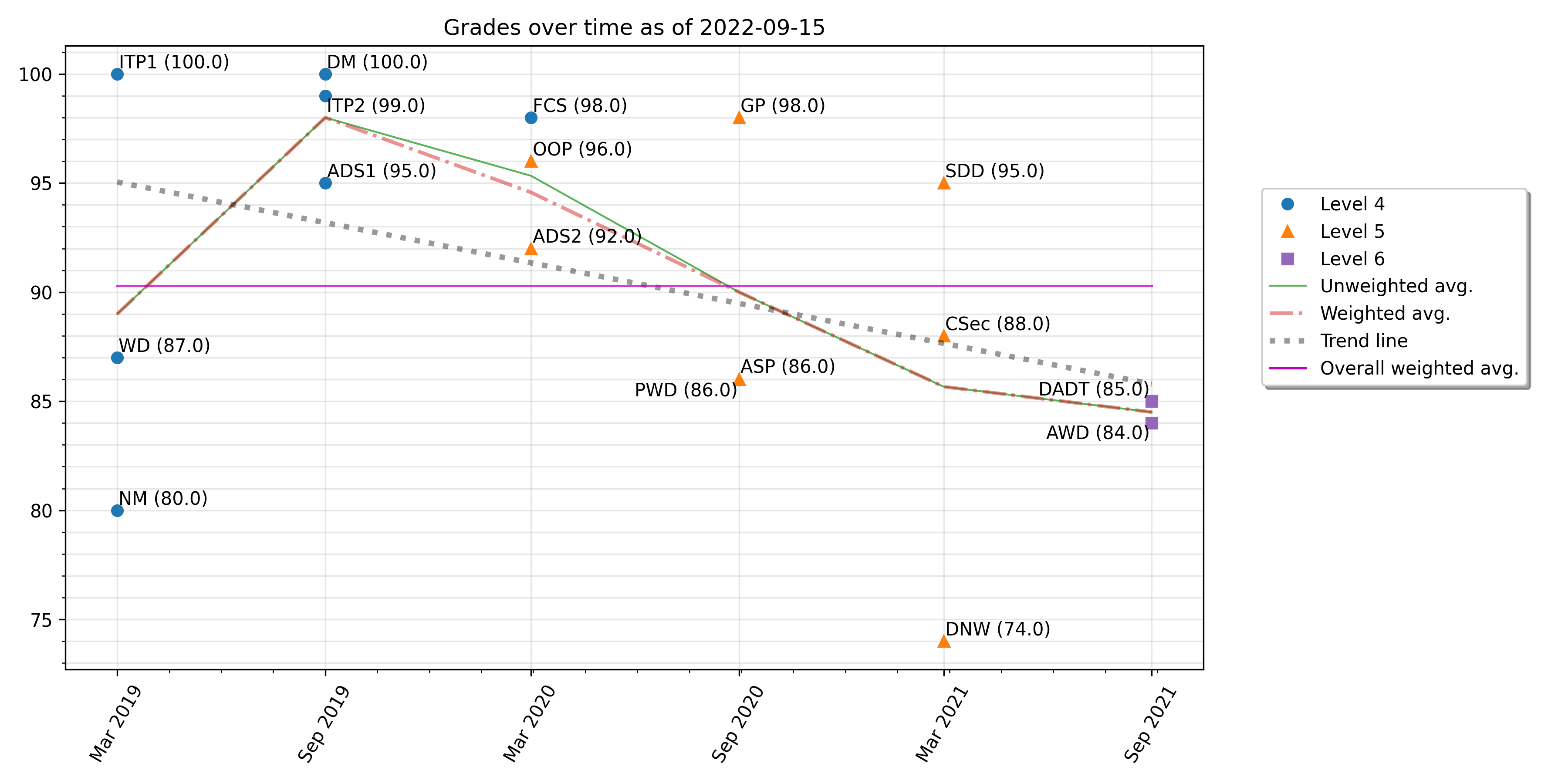
- With more mental processing done upfront, it would have been clear which features should have been part of the tool earlier and which ones could have waited longer. Glancing at the Gantt chart above, one can see that many commits happened at the beginning just to get the structure right, the project was not documented until much later and basic functionality such as being able to plot results (which was really a core feature to be expected) was not integrated until past the mid-life of the project.
- On top of the above, it was clear that using YAML in the presence of the other technologies used for a backend and frontend to the CLI made things more complicated and it wasn’t until one of the latest versions that JSON was used instead.
- The user experience could have been improved drastically at the beginning by relying on well-known libraries such as Rich to make the UI much more appealing and even a bit more interactive.
- Some features were presented in a way that did not make much sense. For instance, the
Dockerfiledoes allow one to use the tool from a Docker container, but not all functionality works out of the box that way (e.g., saving a plot to the filesystem or loading a configuration file). - It wasn’t productive at all to start scattering the few resources put into this project by creating a sister repository uol-grades-calculator-server. The CLI should have been more feature-rich before considering such an endeavor and it should have been made in a way that’s easier for a backend to consume.
plot modules (sub-)command.Key lessons learnt and where to take it from here
- Studying better the available libraries would have avoided some headaches. For instance, the display of what should have been tabular data started out as plain JSON (printing a
dictobject), thenbeautifultablewas used to create some colored output, thenpandasreplaced the previous library because some limitations were found with it — reverting to a plain table output in the process — and finallyrichwas used to create a more decent-looking output. - Likewise, spending more time in the planning department before getting started would probably have resulted in a tool that’s more straightforward to use, focused on the most needed features and possessing a broader feature set by not having invested extra resources on building a backend and a frontend separately. It should have been either a more powerful TUI limited to be used within a terminal or a web application, but not both in the way it was designed.
- Work on small, isolated parts of the system. Some issues were split into large chunks of work (this one for instance, implementing at once the
plotcommand and its sub-commands). This wasn’t a problem per se given that I worked alone, but it would be harder for someone else to follow and to create a reasonably-sized pull request from such an issue. This feature could have been broken down into different sets of related flags.
Conclusion
“Regardless of what we discover, we understand and truly believe that everyone did the best job they could, given what they knew at the time, their skills and abilities, the resources available, and the situation at hand.”
All in all, this has been a fun experiment to bring to fruition. It would have been much quicker to use a spreadsheet given what the final result ended up being, but the experience obtained was worth every drop of developer sweat! Using Python felt appropriate as iterations of the tool could be produced fast and the CLI was responsive enough to be useful and pleasant to interact with thanks to its intuitive commands. In the near future, using a library like Textual could be more rewarding as one could expect a much nicer visual experience in the terminal at a fraction of the current implementation efforts.
Resources and references
- Conventional Commits specification
- How to run a great retrospective - LeadDev
- John Carmack - Twitter
- John Carmack: Doom, Quake, VR, AGI, Programming, Video Games, and Rockets | Lex Fridman Podcast - YouTube
- Mermaid - Markdownish syntax for generating flowcharts, sequence diagrams, class diagrams, gantt charts and git graphs
- PyPI - The Python Package Index
- Read The Docs - Create, host, and browse documentation
- Retrospective - Atlassian
- Retrospective Plans - Agile Retrospective Resource Wiki
- Reverse order of lines - Vim Tips Wiki
- Sphinx - Python Documentation Generator
- Test-driven development - Wikipedia
- Textual - GitHub
- The Prime Directive - Agile Retrospective Resource Wiki
- The Primeagen - Twitter
- The Primeagen - YouTube
- You aren’t gonna need it - Wikipedia